
G. Answer Control
Chat Components
Let the assistant answer with interactive elements like quick replies, pricing tables, and cards, instead of plain text. Turn each type on or off.
Updated 17 Sep 2026
Chat Components let the assistant answer with interactive elements instead of plain text. A price question can return a pricing table; a product question can return a product card. You choose which components are allowed.
Where to configure it
Open your domain, then go to Settings > Conversation > Chat Components.
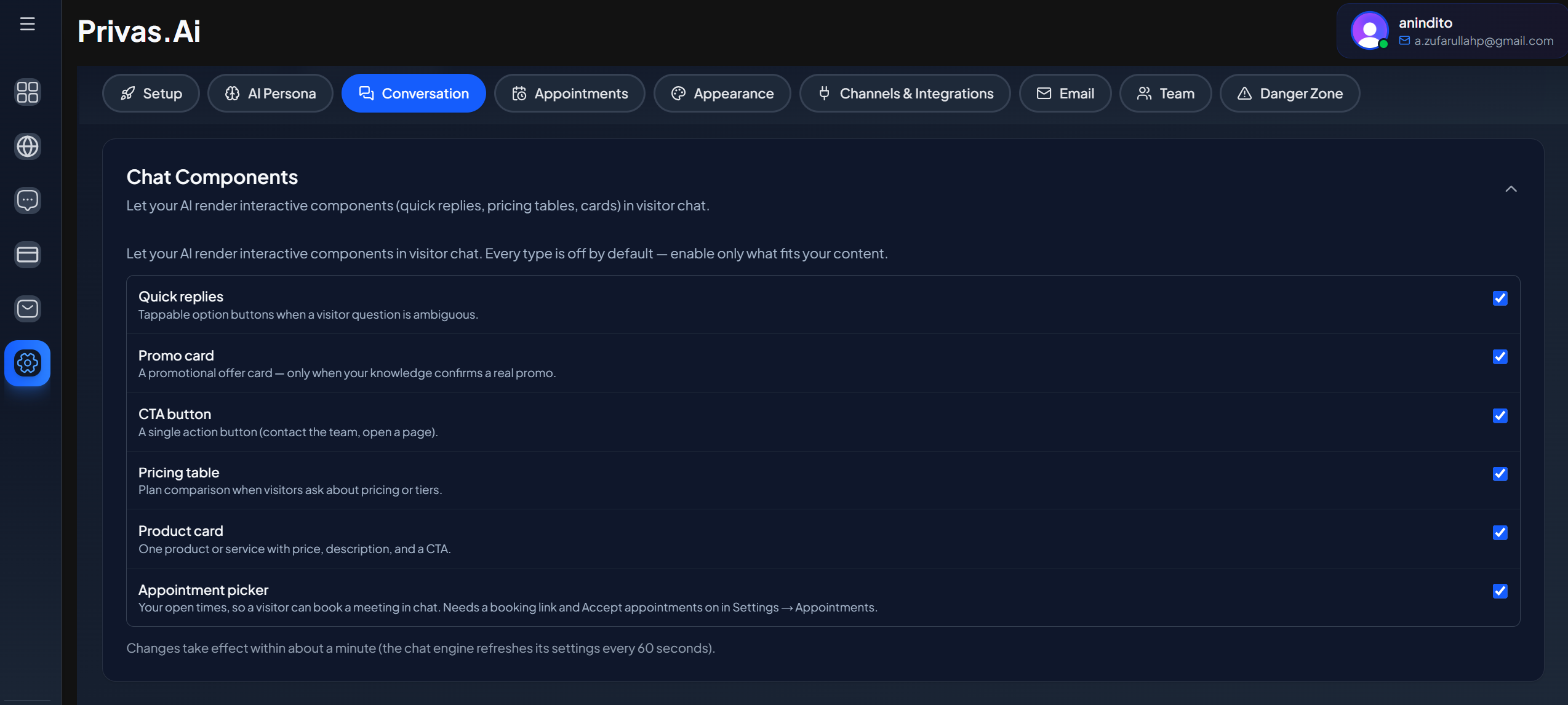
Available components
- Quick reply. Tappable options that continue the conversation.
- Promo card. A highlighted offer or announcement.
- Call-to-action button. A single clear action, such as booking or contacting you.
- Pricing table. Plans or prices laid out for comparison.
- Product card. A product with its key details.
- Appointment picker. Your open times, so a visitor can book a meeting without leaving the chat. It needs Appointments set up first. See Booking in Chat.
Turn each type on or off
Each component type has its own toggle. Enable the ones that fit your business and leave the rest off. The assistant only uses a component when it is enabled and when it fits the answer.
A per-session limit
To keep conversations clean, there is a limit on how many components can appear in a single session. Once the limit is reached, further answers continue as normal text. This prevents a conversation from filling up with cards.
The appointment picker has its own separate limit, so other components never use up the chance to offer a booking.
Where components appear
Components render the same way across your surfaces: the website widget, the share link, and the admin conversation view your team uses to review chats.
The appointment picker is the exception. It works on the website widget and the share link, but is not shown in the admin conversation view. Bookings made through it appear under Settings > Appointments.
Next step
To show a component automatically when a condition matches, continue to Proactive Rules.