B. Getting Started
Customize Widget Appearance
Adjust visual style so the AI representative matches your website brand.
By aninditoUpdated 4 Mar 2026
This guide explains how to visually integrate the AI representative into your website.
By default, the chat widget uses standard styling.
Before installing it publicly, you should adjust its appearance so visitors recognize it as part of your website.
The goal is simple:
Visitors should feel they are talking to your business — not to an external tool.
Why this matters
Visitors decide whether to interact within seconds.
If the chat widget looks unrelated to your website:
- visitors may hesitate to click
- it may feel like an advertisement or popup
- engagement decreases
When the widget matches your brand, it feels like a natural help or contact point.
This significantly improves conversation rates.
Open Appearance Settings
- Open your domain in the Domain Center
- Navigate to Appearance Settings
You will see a live preview while making changes.
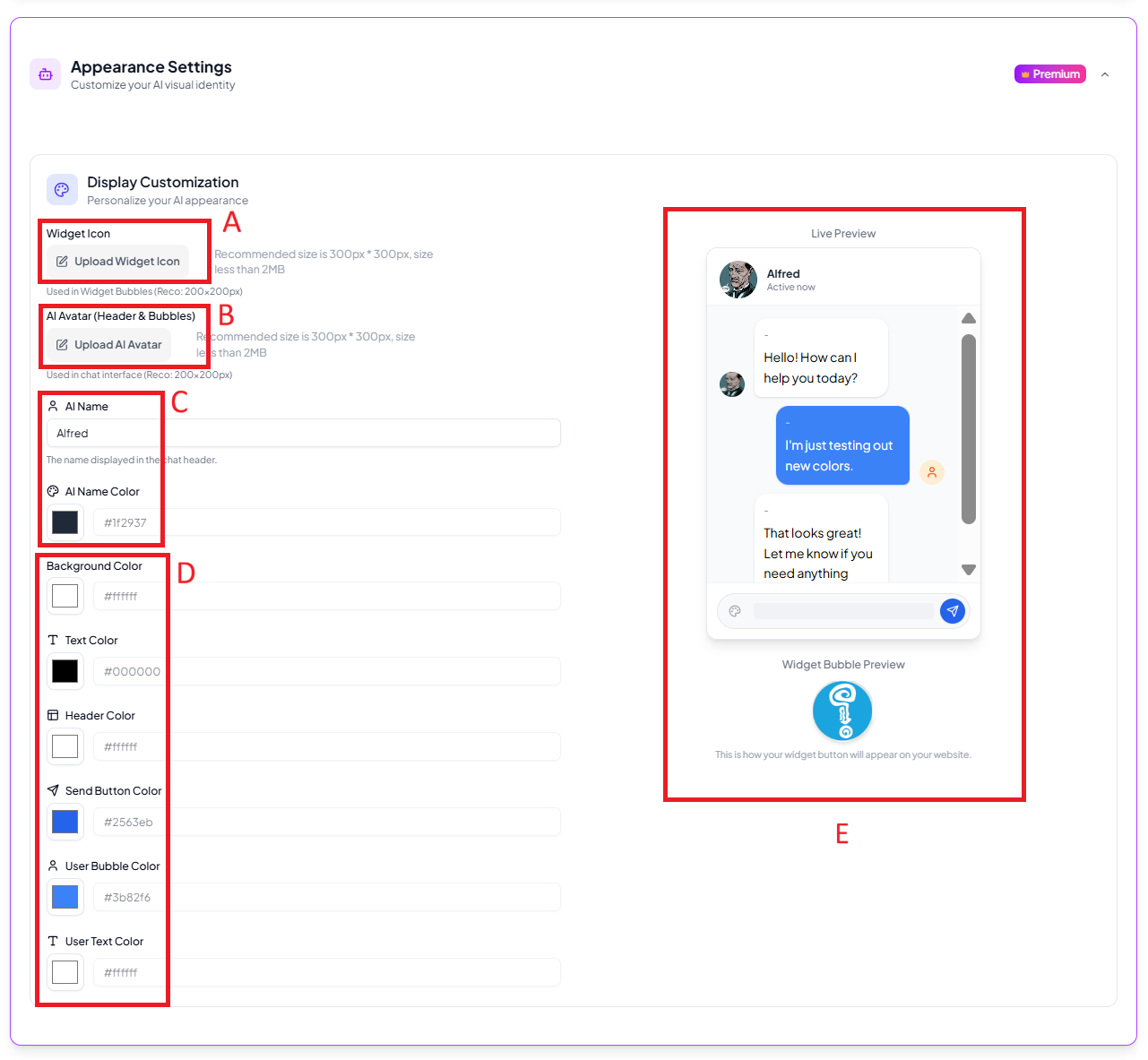
A. Widget icon (chat button)
The widget icon is the floating button visitors click to open the chat.
Recommended:
- square image
- approximately 300 × 300 px
- simple symbol
- transparent background
Avoid:
- long text
- detailed illustrations
- full logo with small typography
The icon appears small, especially on mobile screens.
Clarity is more important than detail.
B. Representative avatar
The avatar appears inside the conversation window and message bubbles.
You may use:
- a mascot
- a brand symbol
- a simple character illustration
Avoid banners, screenshots, or complex photos.
The avatar helps visitors recognize who they are interacting with.
C. Representative name
The name appears at the top of the chat window.
Choose a name that clearly communicates purpose.
Good examples:
- Support
- Customer Care
- Product Assistant
- CompanyName Support
Avoid unclear or overly personal names that may confuse visitors.
The name should help visitors immediately understand the role of the representative.
D. Color settings
You can adjust several visual elements:
Header color
Controls the top bar of the chat window.
Use your primary brand color.
Background color
Controls the conversation background.
Keep it light for readability.
Send button color
The message send button.
Match your primary accent color.
Visitor bubble color
Messages sent by visitors.
Text color
Ensure high contrast for readability.
Color selection tips
Good practice:
- use one main brand color
- keep backgrounds neutral
- ensure strong text contrast
Avoid:
- dark background with dark text
- overly bright colors
- too many different colors
If reading messages requires effort, visitors will stop interacting.
E. Use the live preview
While editing, watch the live preview panel.
Check:
- message readability
- contrast
- mobile-size visibility
- icon clarity
Adjust until the chat feels like a natural part of your website interface.
After saving
Changes apply immediately to the widget.
You may need to refresh your website page to see updates.
This step only affects appearance.
It does not change behaviour or knowledge.
What’s next
Your representative now visually matches your website.
Continue to Go Live and then Install the Website Widget to make it available to visitors.